Design Snippets is an educational mini-series of blog posts describing all you need to know about basic elements and components of user interfaces from a design perspective.
A snippet is a programming term for a small region of re-usable source code, machine code, or text.
The fifth part of the series focuses on forms. You have probably already filled in a number of them in your lifetime, either digital or paper. Filing them can either be a breeze or a truly daunting experience. It all depends on how much thought has been put into the form's design. Read further to discover the basics of form design.
Overview & Structure
We use forms for various purposes, such as creating an account, signing up for newsletters, buying a product, ordering a service, participating in a survey or leaving a review. Despite being used for such a broad range of reasons, forms have multiple things in common. Most notably, their main objective – gathering users’ information. Another thing they have in common is the way they are structured and how the components, such as inputs and action buttons, are used. We’ll cover that below.
Form structure is created by organizing form components (inputs, buttons, etc.) in an appropriate order based on their content and relationships between them.
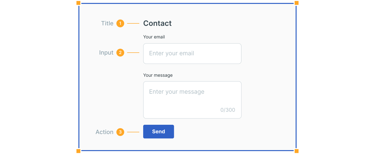
1. Title
A title describes the form. Its size depends on whether the form is the main item on the page or one of its parts. A short description can follow a title to provide more information.
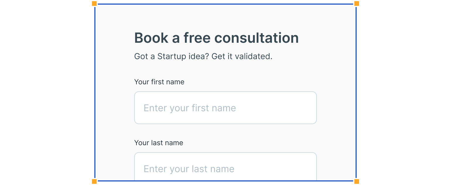
2. Inputs
Inputs are the most common form component. They allow users to fill in a form with requested information. Many different types of inputs exist, the most common being text fields, followed by dropdowns, checkboxes, radio buttons, etc.
Click on the links to learn more about each one in our previous Design Snippets blog posts.
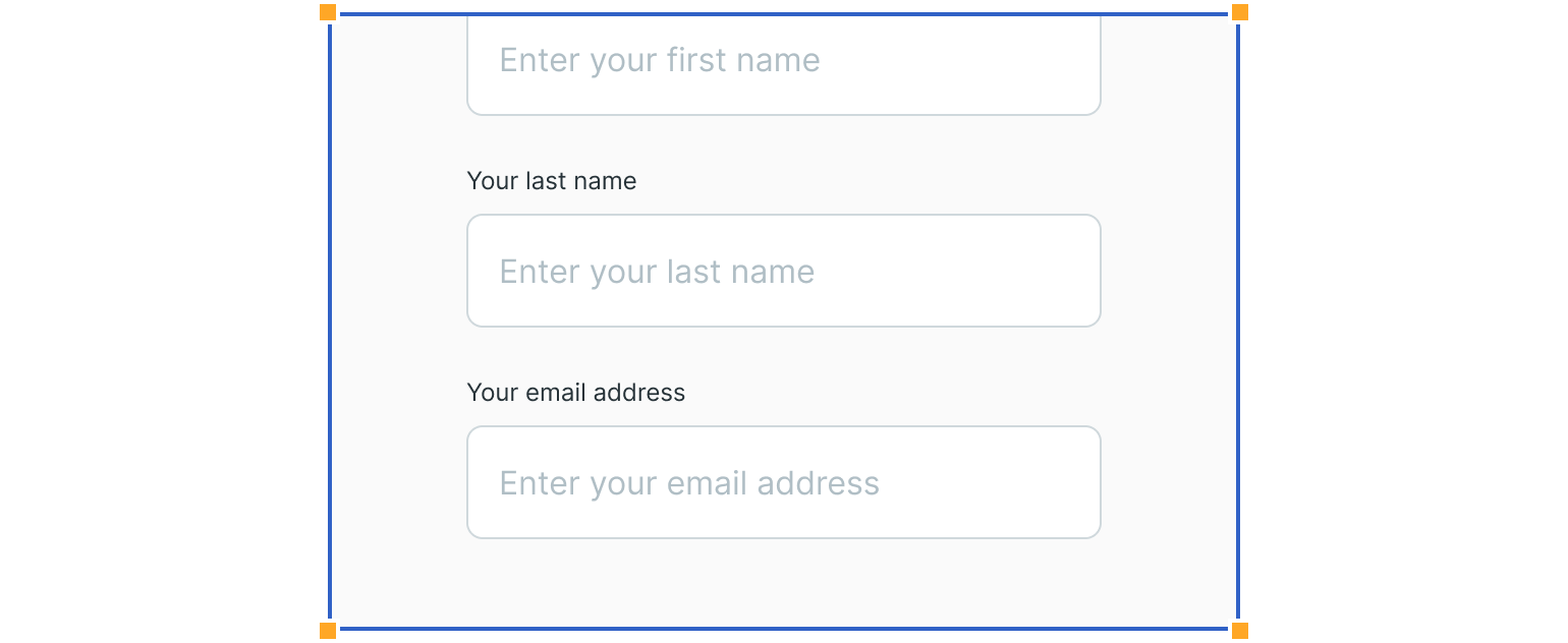
3. Action Buttons
The next important component is action buttons. They allow users to complete activities, like submitting a form or, in some cases, abandoning it.
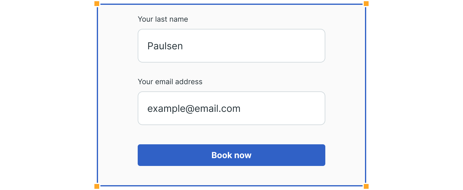
Validation & Feedback
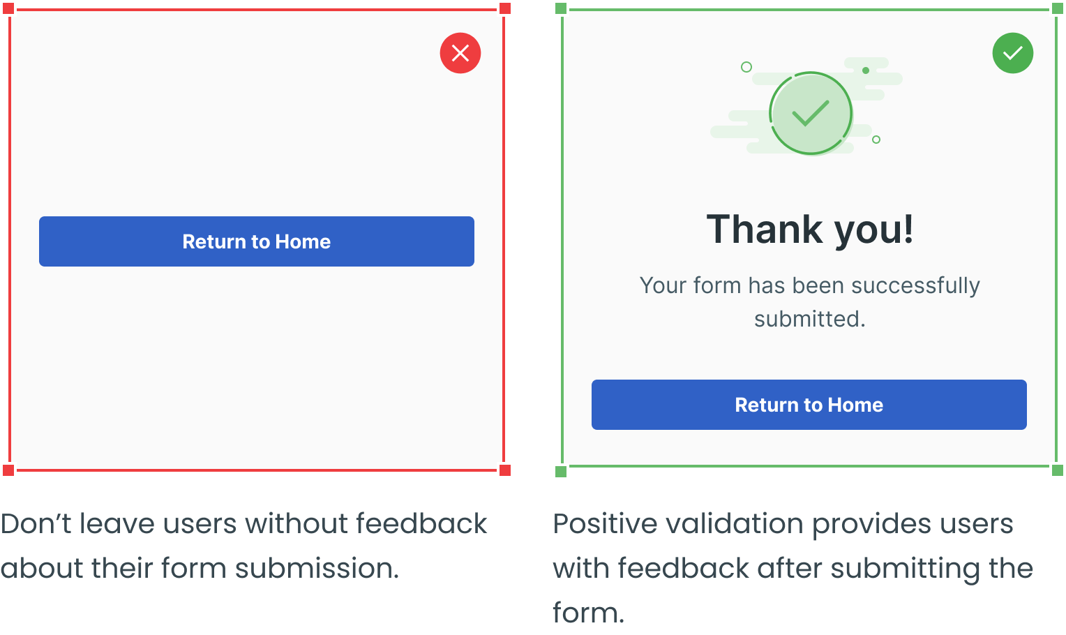
Feedback is also a crucial part of forms. It offers users the possibility to understand the result of their actions. It can be positive when they submit the form successfully or negative if the information input is incorrect – for example, using a wrong password.

Assistance
Another essential part, especially in complex forms, is assistance. It is usually presented as an explanation that helps users fill in the form.

Guidelines
Here are some examples of how to structure forms and what to avoid.
Place Form Components in a Logical Order
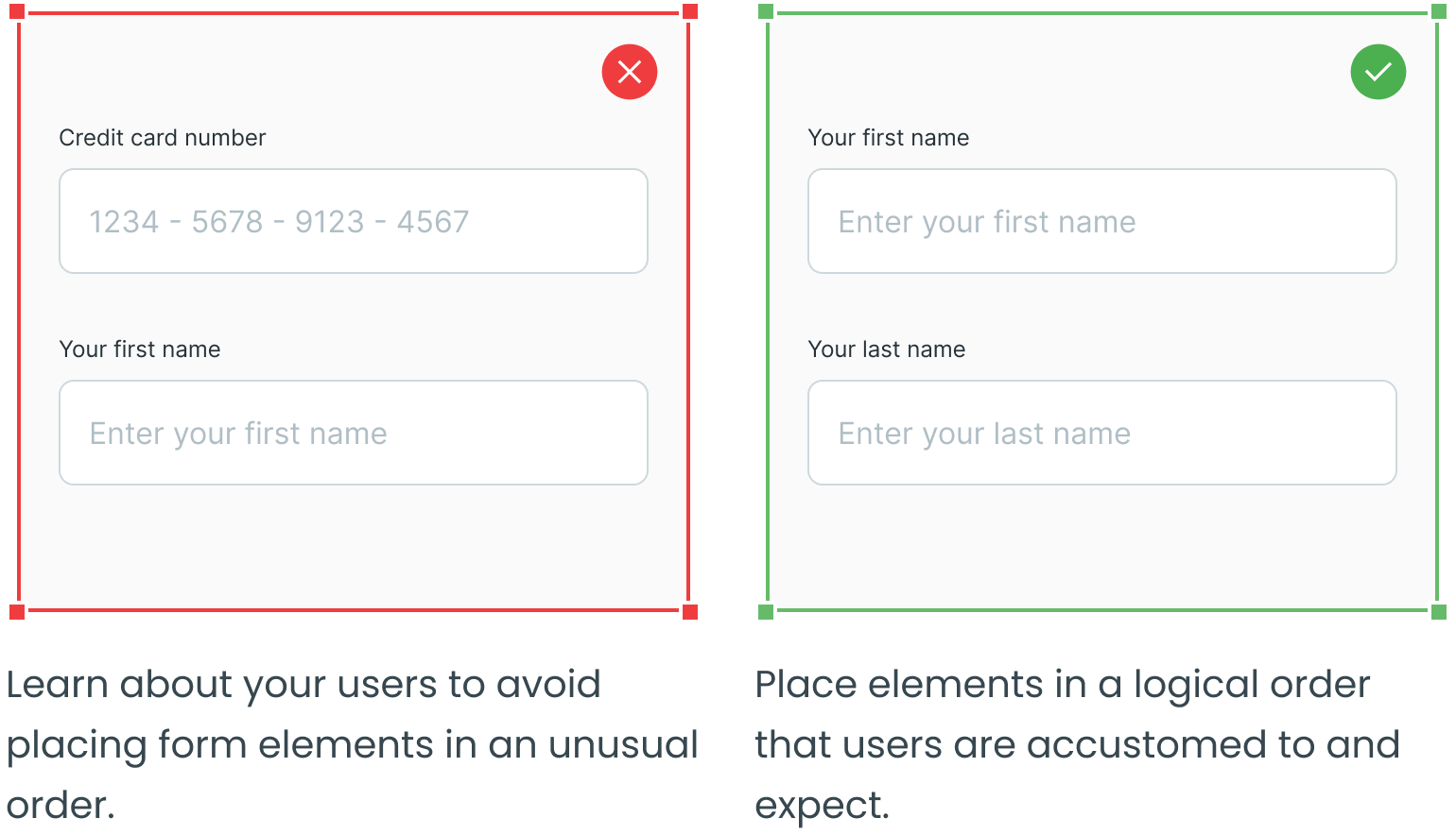
Group Related Inputs
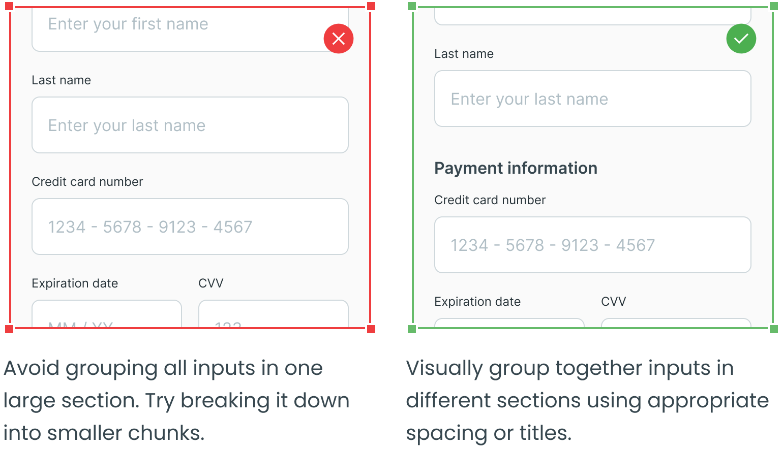
Break Long Forms Down Into Smaller Steps

Avoid Asking for Unnecessary Information When Possible
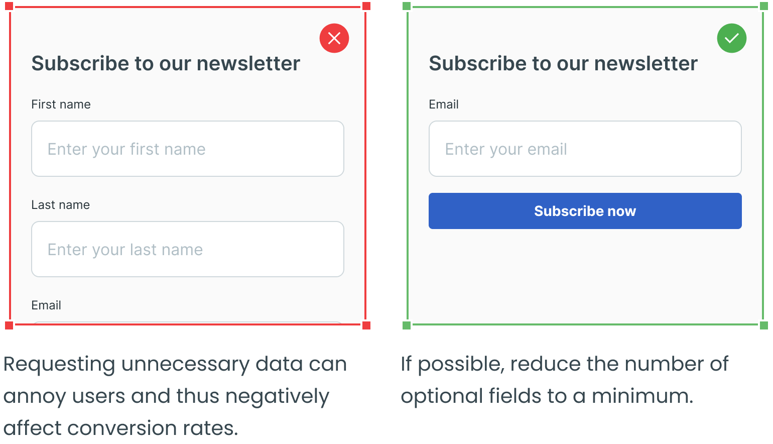
Clearly Distinguish Required and Optional Fields
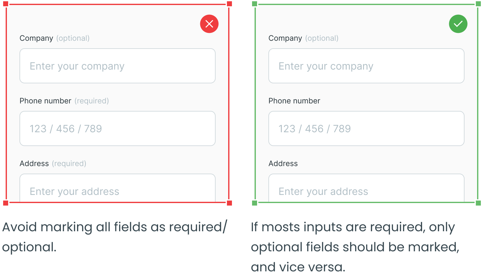
Make Use of the Naming Conventions
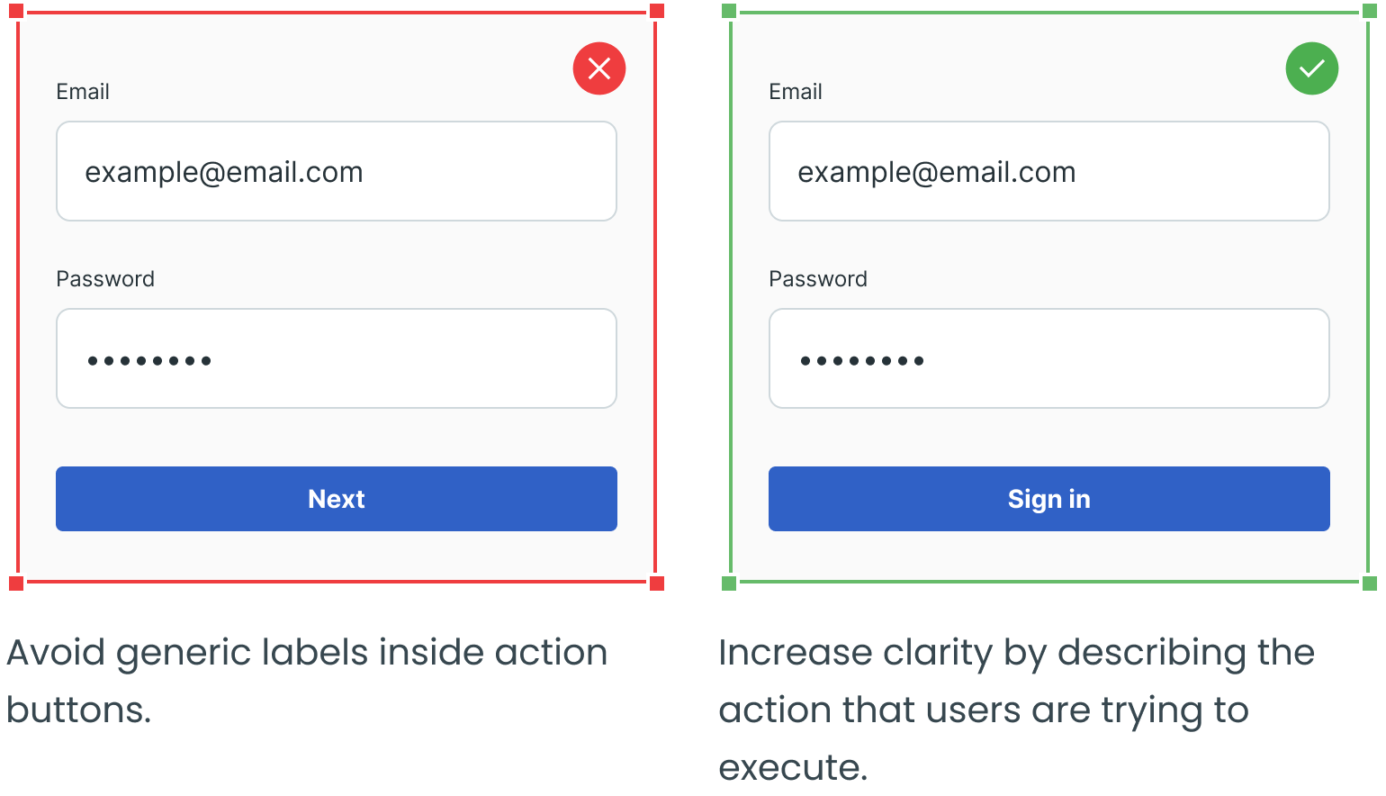
Establish Button Hierarchy
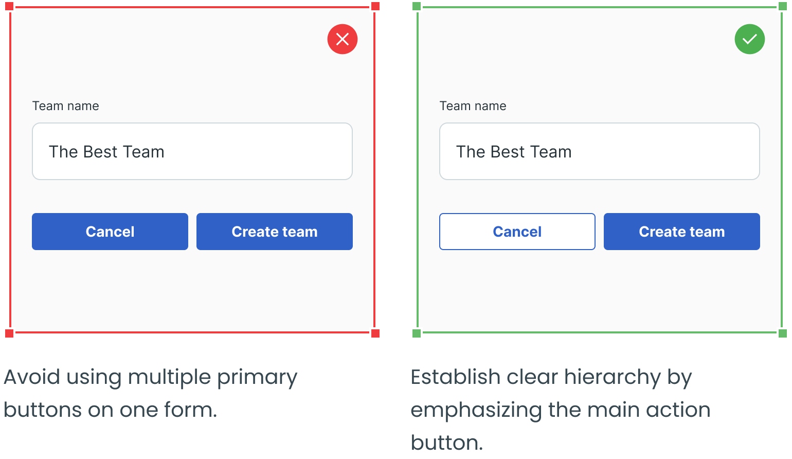
Avoid “Reset” Buttons, Allow “Cancel” Buttons
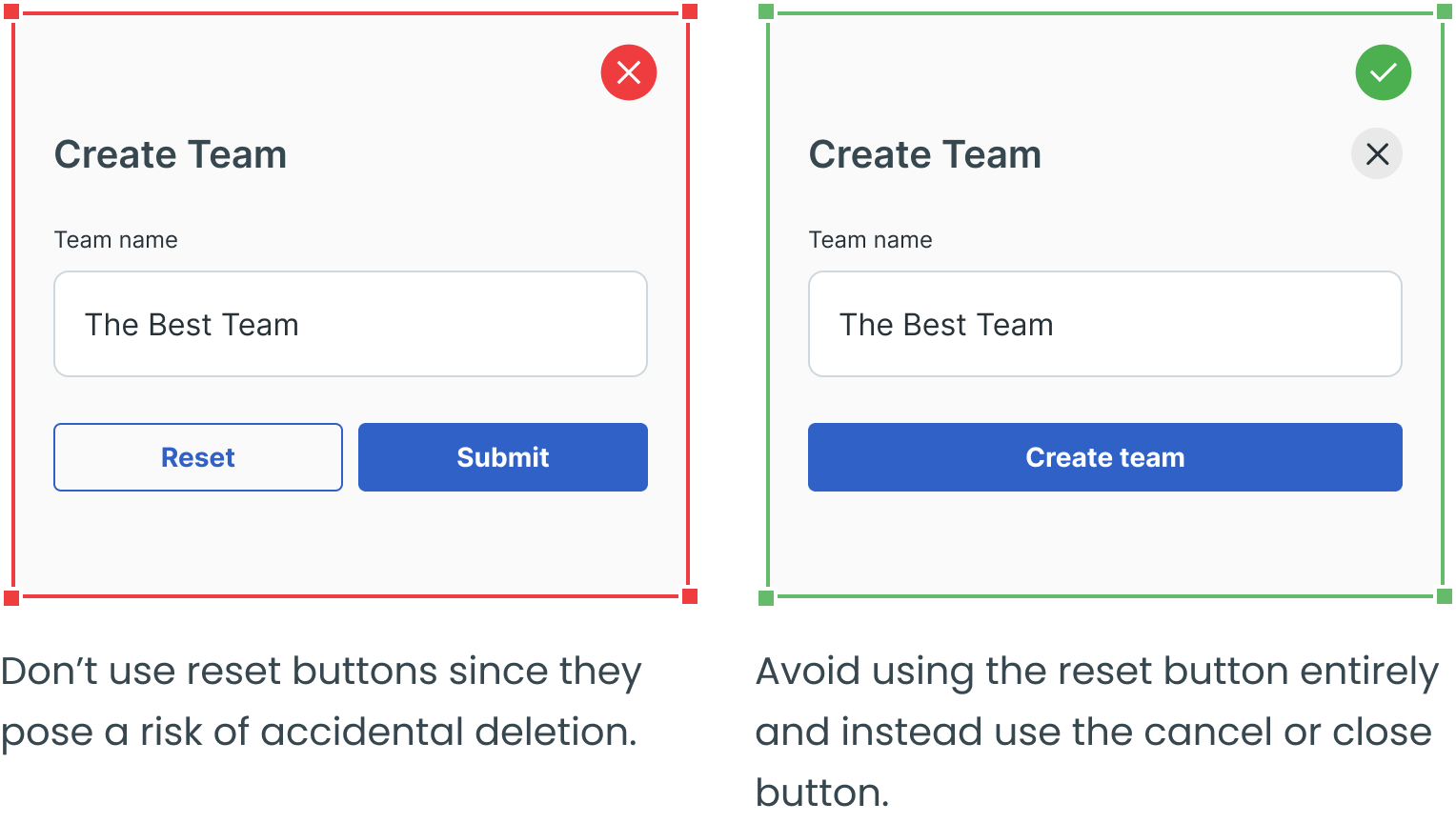
Use Inline Validation Where Appropriate and Don’t Validate Too Soon
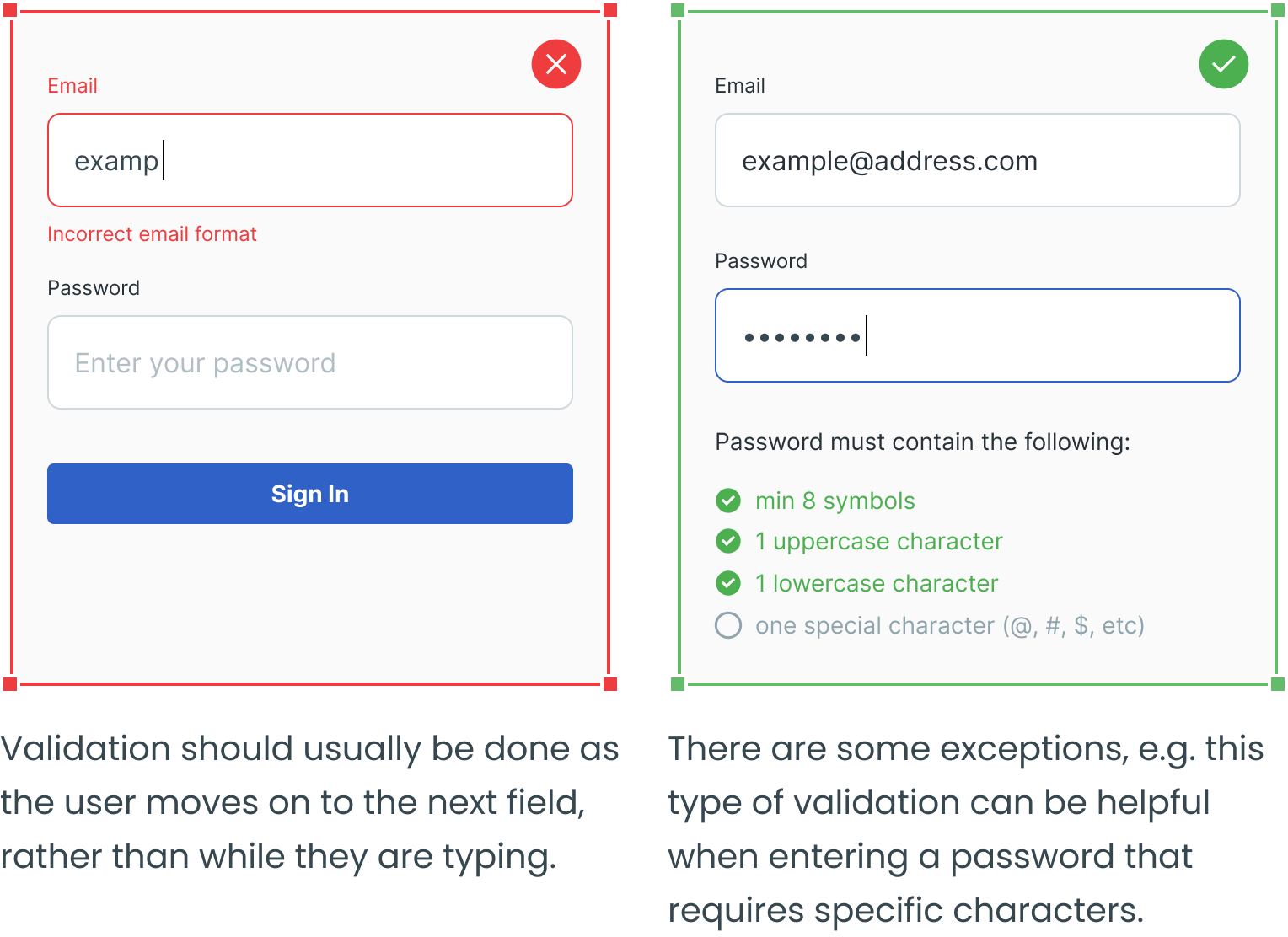
Make Error messages Visible
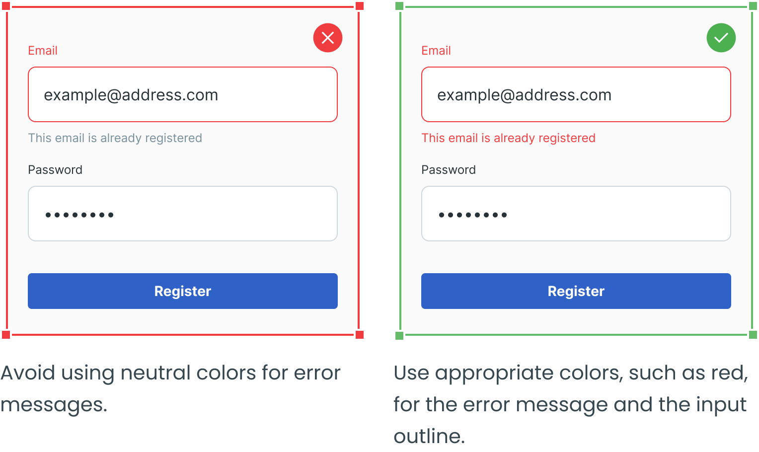
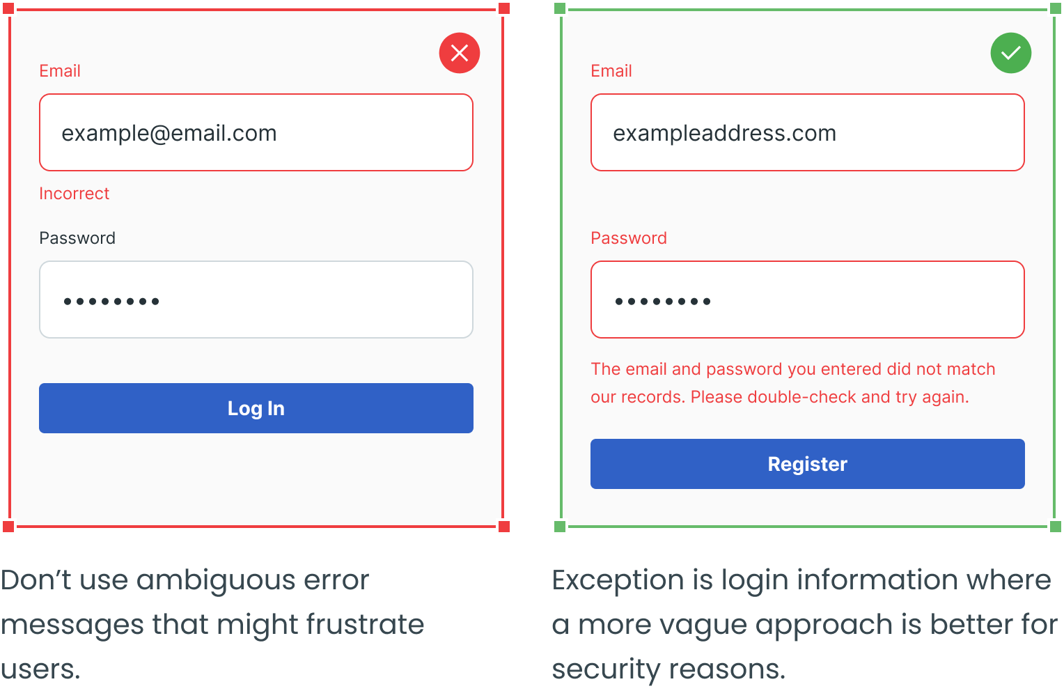
Avoid Unclear Error Messages
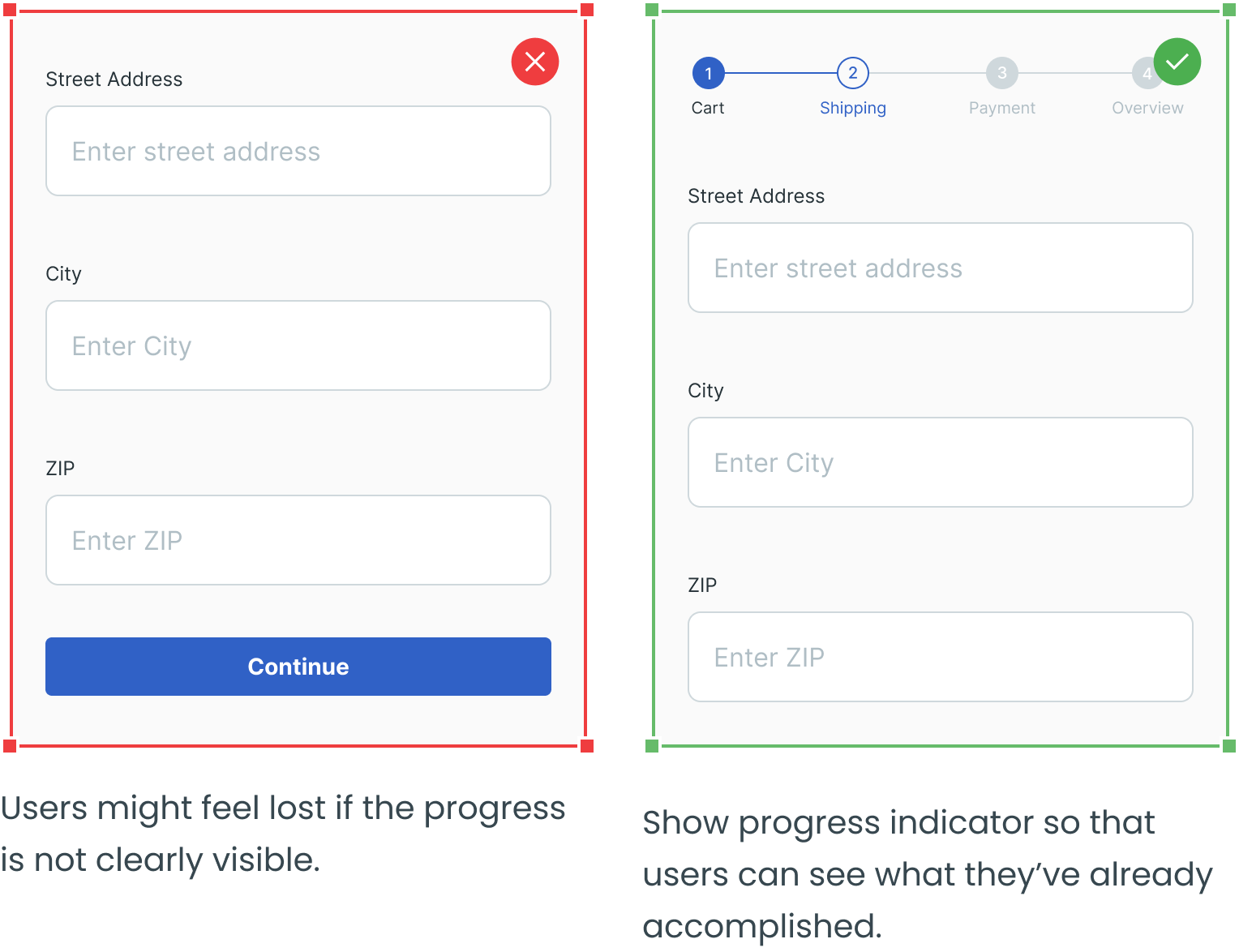
Add Progress Indicator
Don’t Forget About Success Messages
Use Tooltips To Provide Additional Information

_____
Text fields, dropdowns, radio buttons, and checkboxes are four other essential user interface elements you should be familiar with in addition to forms.
Check out the rest of the series for more information on each design element, as well as guidelines for their use:


