Want to elevate your UI/UX design to the next level and achieve concrete results? Let's get into it.
For that, we've prepared insightful mini-series: design snippets, where we provide you with invaluable design insights. Today, we're delving into the world of checkboxes, a design element that can transform your digital experiences and bring benefits to your users and business.
At Povio, we understand the importance of exceptional design in capturing your audience's attention and most importantly ensuring seamless interactions tailored to your user-flow.

Checkboxes: Simple Magic?
In this installment, we unveil the magic behind checkboxes, a versatile user interface component that empowers users to select the options that matter most.
Beyond enhancing user experiences, checkboxes can drive measurable value, creating a more user-friendly environment, reducing errors and support costs, improve conversion rates, enhance customer satisfaction, and ensure compliance.

All of these factors contribute to the measurable business value, including cost savings, increased revenue, and overall growth. Therefore, investing in the effective design of checkboxes can have a substantial impact on performance and success.
Simplify and Enhance: The Checkbox Structure
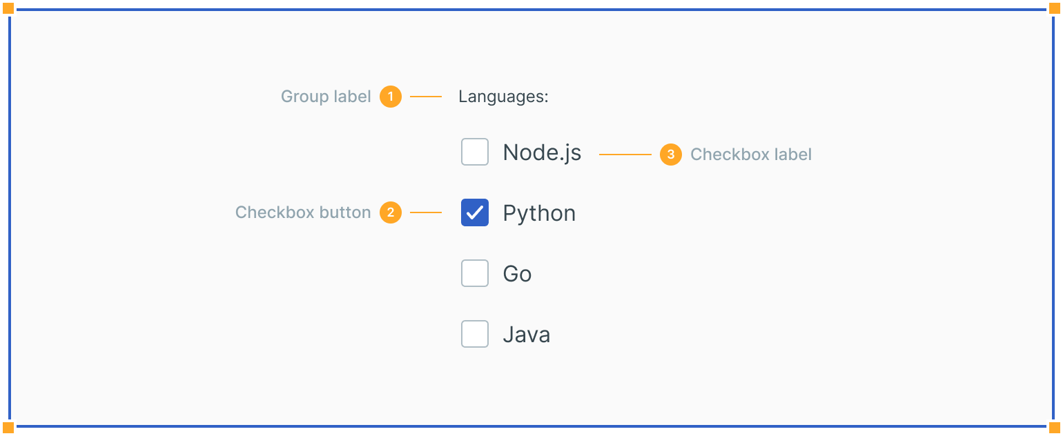
Group Label: This guides your users, making their choices clear and meaningful.
Checkbox Button: A clear indication of the selected or unselected state.
Checkbox Label: Describes the option, ensuring users understand the consequences of their selections.
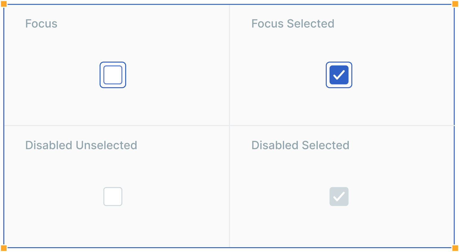
Experience the Full Spectrum: Checkbox States
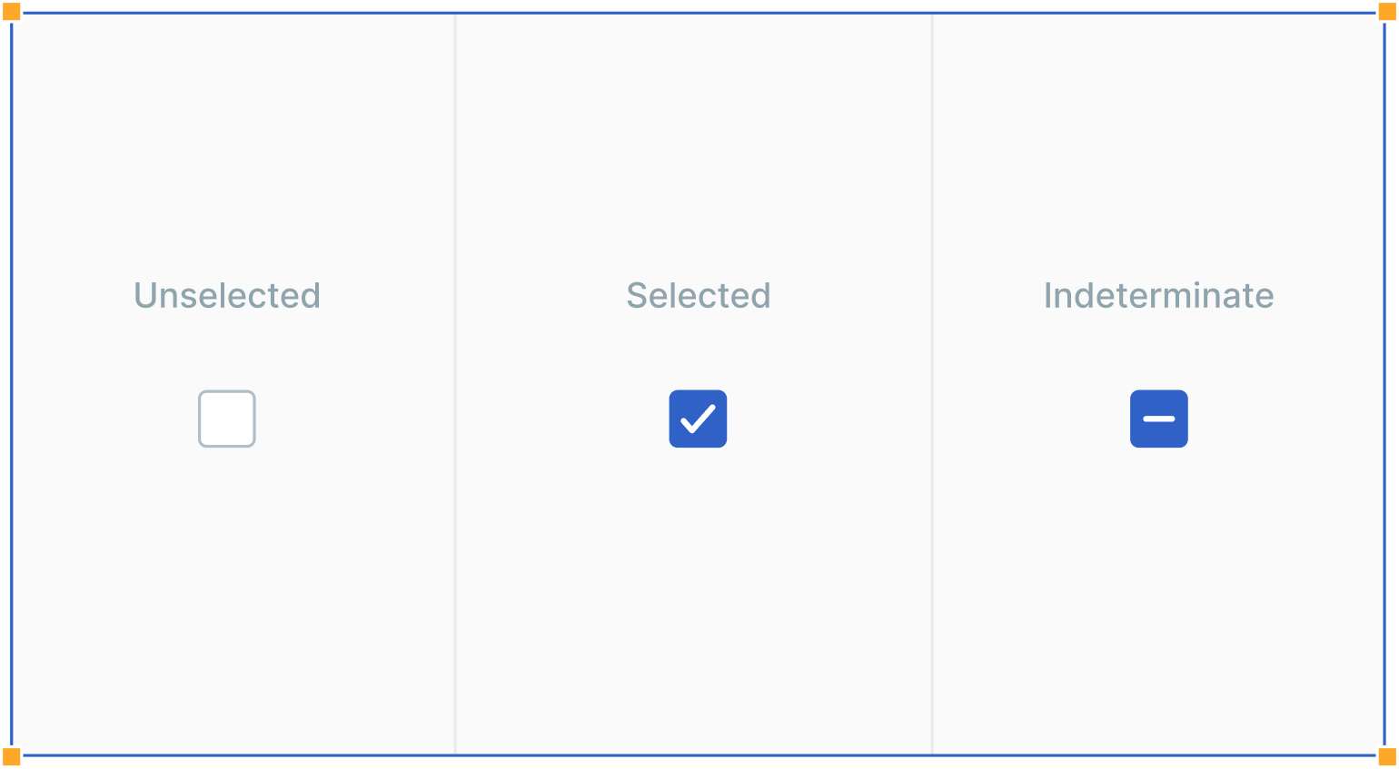
Checkboxes offer various states, from unselected to selected and even the useful indeterminate state. We also cover focus and disabled states to ensure your design is accessible and user-friendly. An accessible design can broaden your customer base, increasing your revenue potential. While you also build user understanding, engagement, and satisfaction, plus foster brand trust.
Seamless Interactions: The Power of Clicks

Users can interact with checkboxes by clicking either the checkbox input or the label, providing a larger clickable area for improved accessibility. This enhanced usability leads to higher conversion rates.
Providing a larger clickable area for checkboxes by allowing users to click on both the checkbox input and the associated label is a user-centric approach that enhances the user experience. It reduces friction, speeds up decision-making, ensures accessibility and inclusivity.
Here's another useful click:
Unleash Creativity: Checkbox Nesting
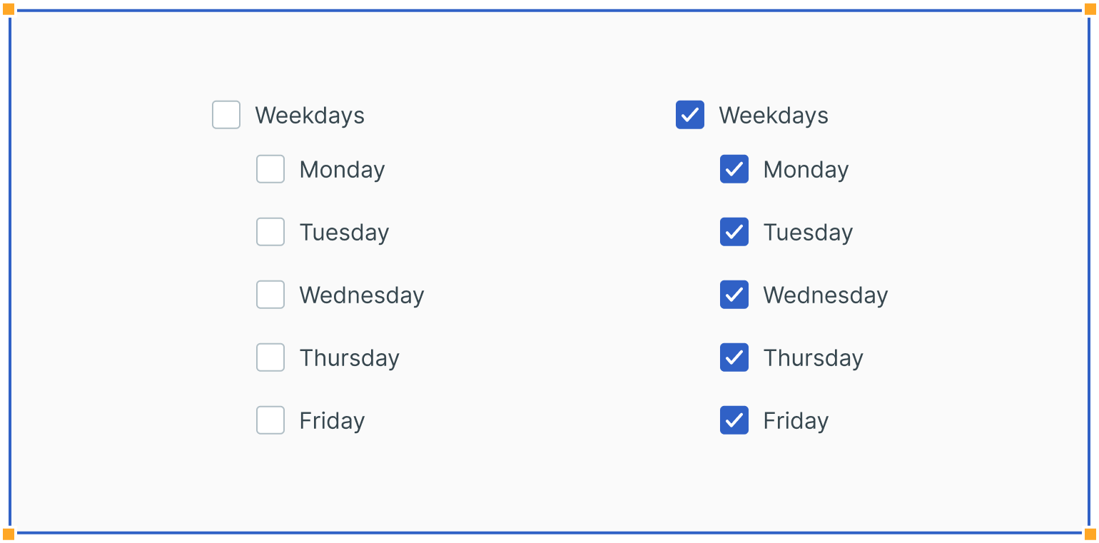
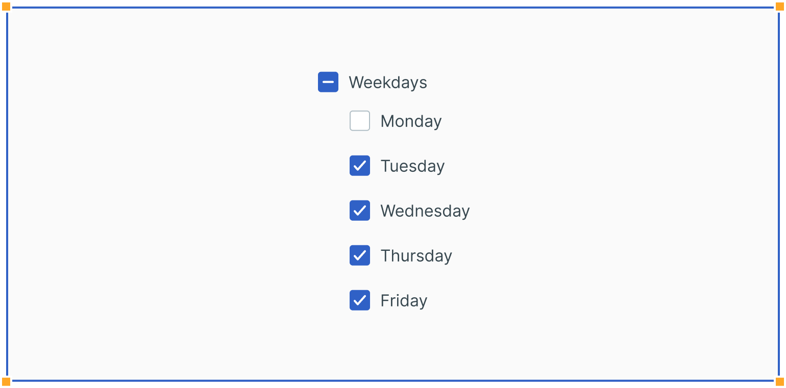
Take your design a step further with nested checkboxes, allowing users to select entire sets or individual options. The master checkbox simplifies selections, and the indeterminate state intelligently handles complex choices. This level of flexibility can lead to customer satisfaction and retention, boosting long-term growth.
By understanding and accommodating the nuanced needs of your users, you can create a more valuable and competitive product or service.
Endless Possibilities: Practical Uses for your Business
Checkboxes are incredibly versatile and can be employed practically in various scenarios. Some examples include:
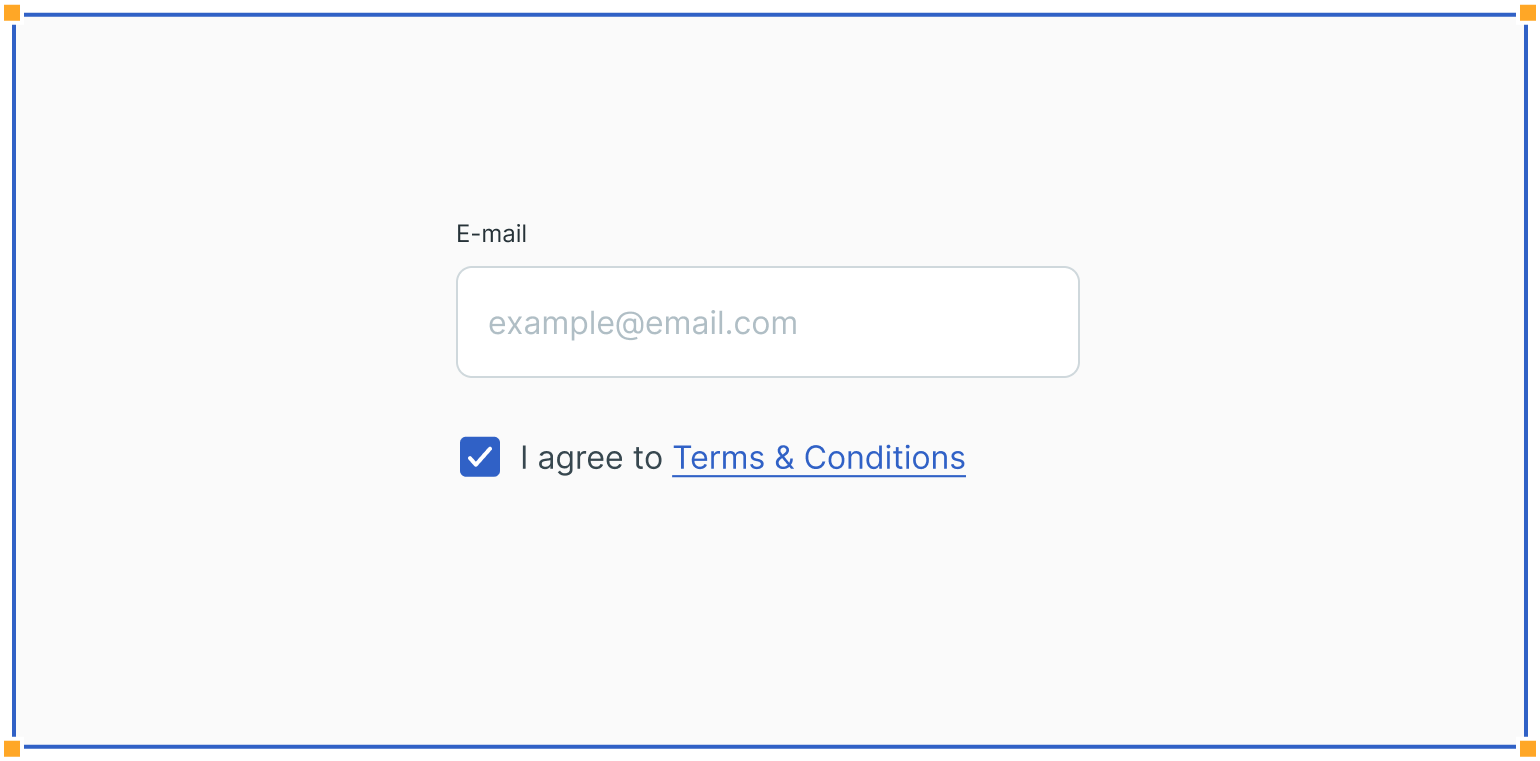
Single Selections: Perfect for making choices like accepting terms and conditions, ensuring legal compliance and reducing legal costs.
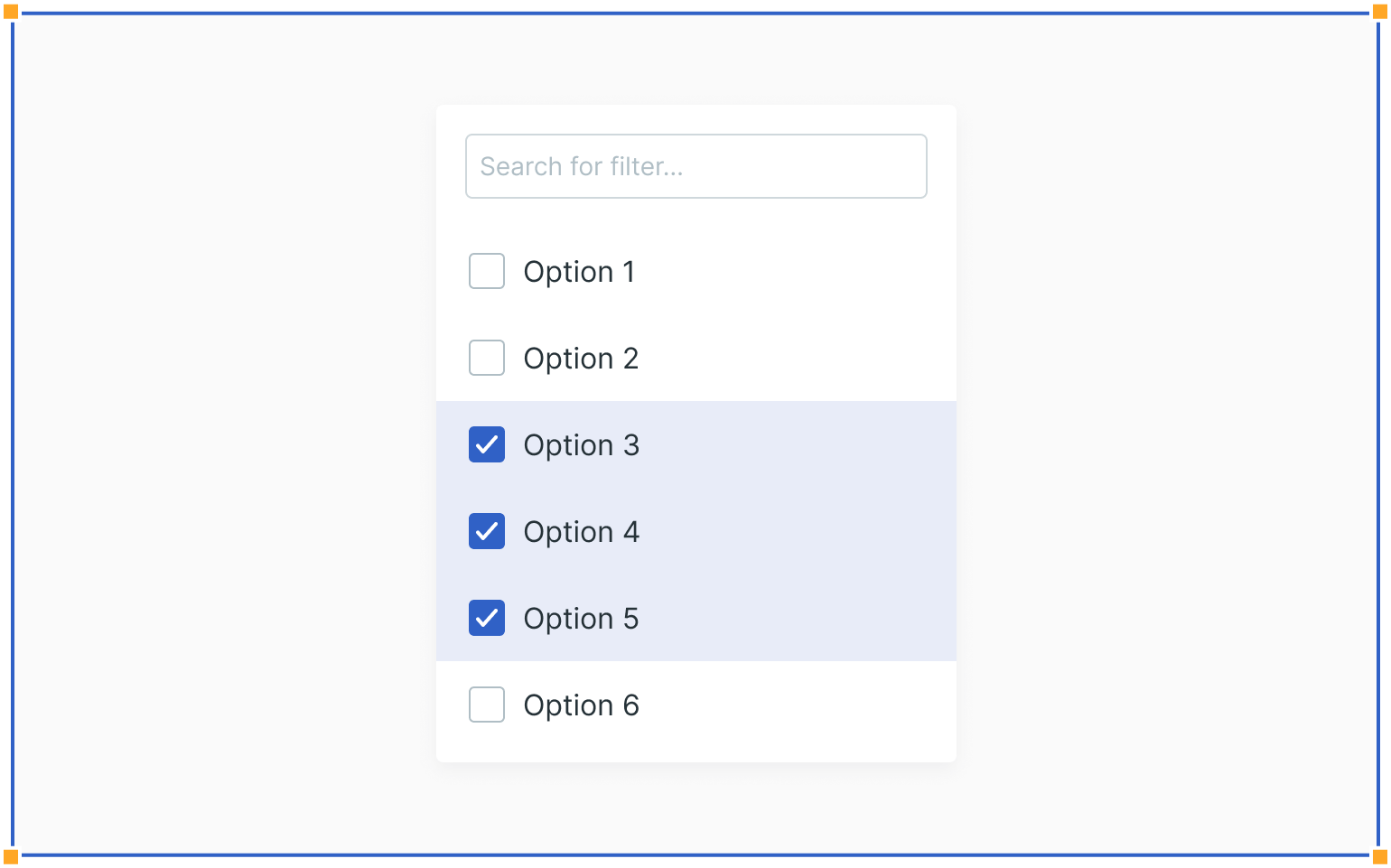
Filters: Ideal for filtering options in dropdowns, improving user experience and helping customers find what they need faster, leading to increased sales.
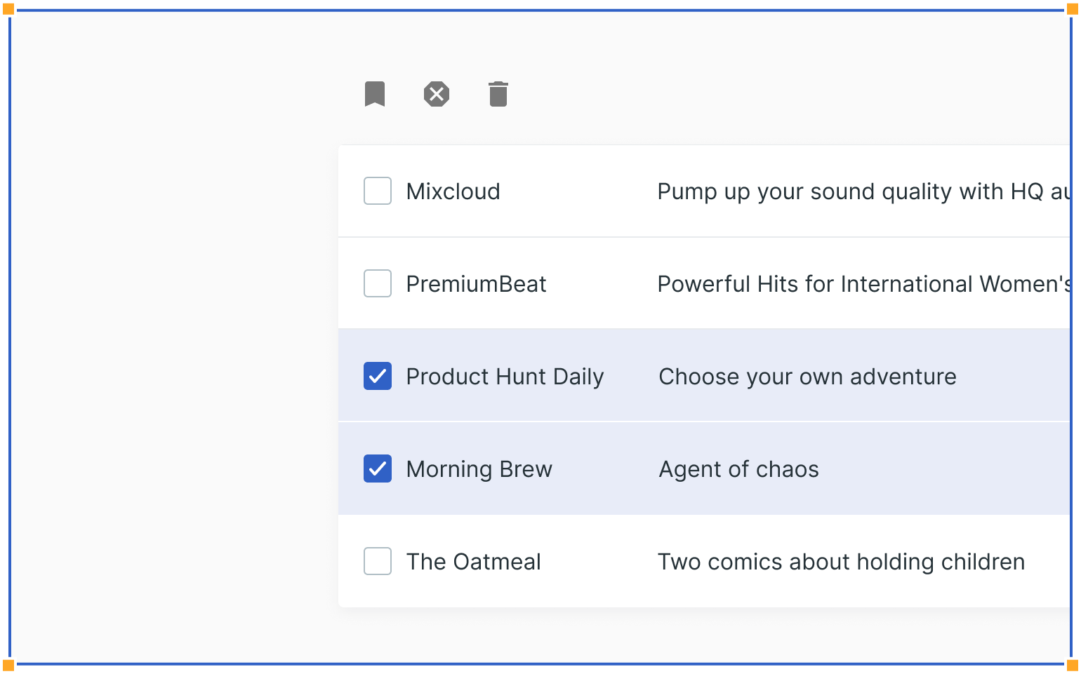
Lists: Commonly used in forms for selecting related items, streamlining the user journey and reducing cart abandonment for example.

Data Tables: Empower users to select multiple items and apply actions efficiently, enhancing the efficiency of data management processes.
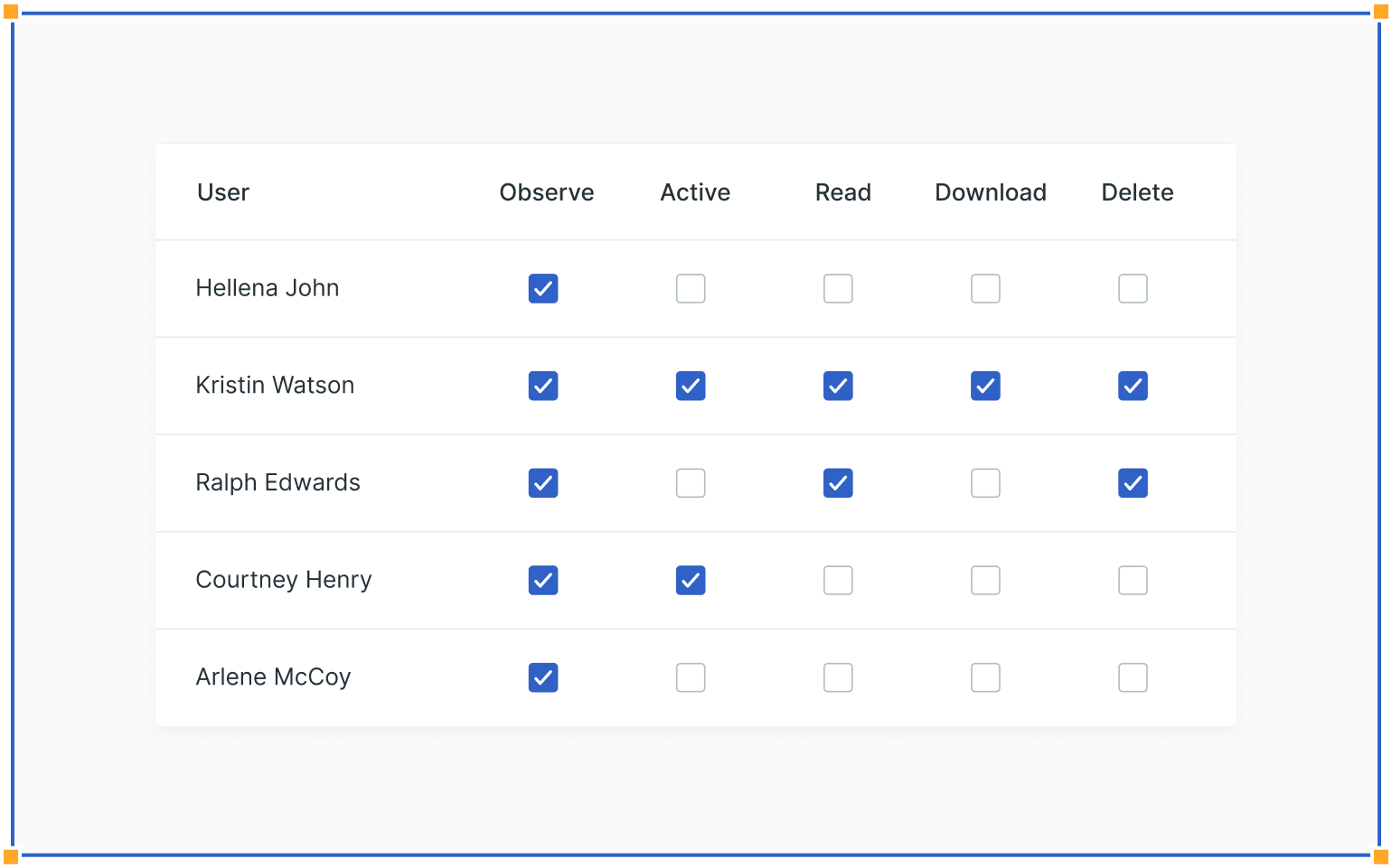
Permissions: Essential for user settings, enabling administrators to manage permissions effectively, saving time and reducing administrative costs.
Enhance Your Design Journey with Povio for Business Success
If you're starting a new project, updating your user interface, or looking for expert guidance, Povio is your design partner. We're here to help you improve your digital experiences, engage your audience, and ensure smooth interactions through our top-notch design services. Plus, you can enjoy the financial advantages that exceptional design brings.
Are you eager to elevate your design and achieve tangible business growth? Get in touch with us today to discover the countless ways design excellence can boost your bottom line!
That’s not All - Guidelines for Success
We provide you with clear guidelines on how to make the most of checkboxes, such as understanding when to use checkboxes versus switches or radio buttons and using positive and active wording. Following these best practices can reduce design iteration costs and improve user satisfaction.
Checkboxes are just the beginning. Don't forget to explore other crucial user interface elements like text fields, dropdowns, radio buttons, and forms. Our series is your go-to resource for in-depth insights on each design element and valuable usage guidelines.
For an Instant Design Upgrade: Click Below for Your FREE Audit.