Design Snippets is an educational mini-series of blog posts describing all you need to know about basic elements and components of user interfaces from a design perspective.
A snippet is a programming term for a small region of re-usable source code, machine code, or text.
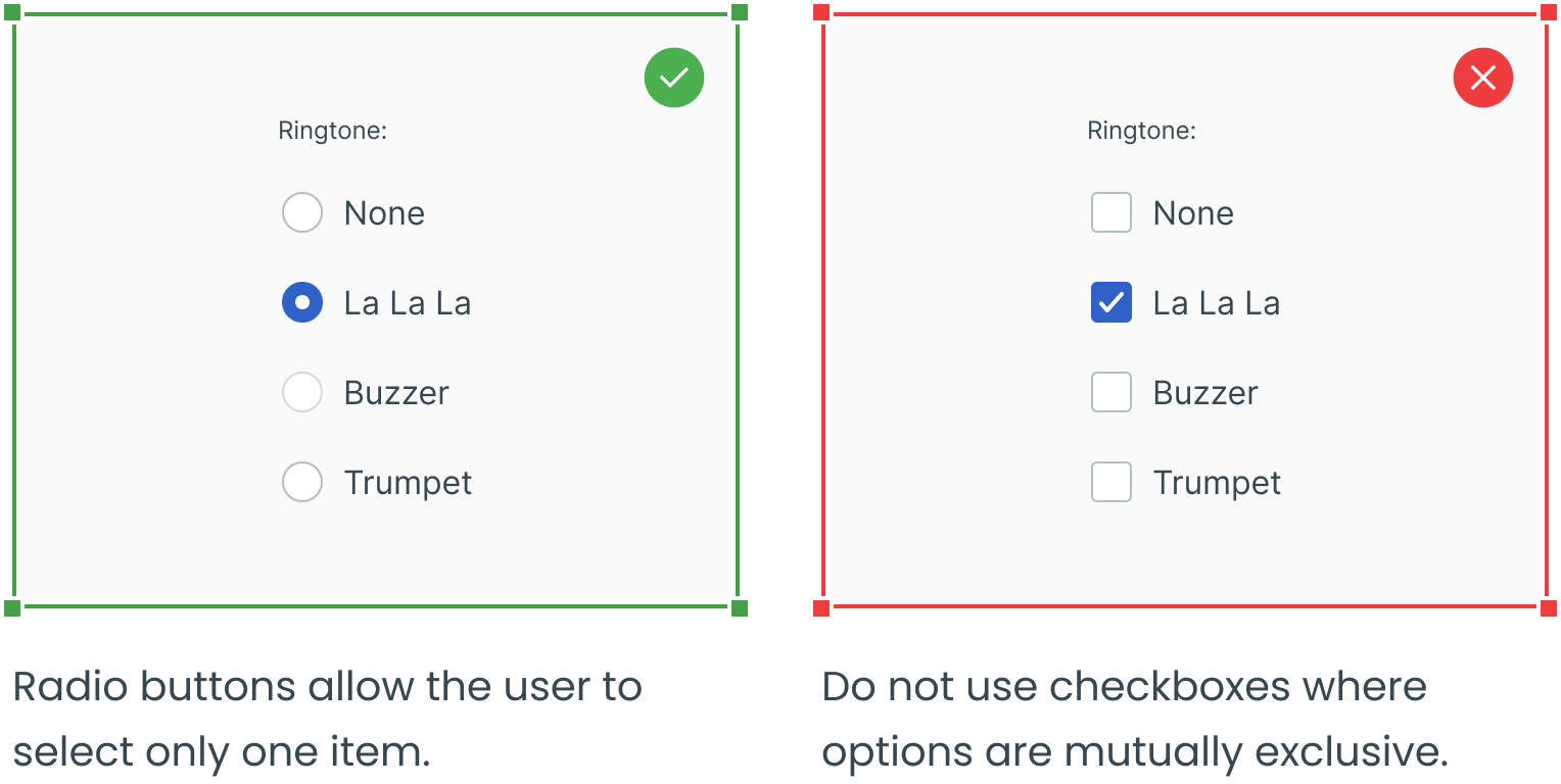
The third part of our series focuses on radio buttons, a user interface (UI) component that displays a set of mutually exclusive options from which you may select only one. Thus, the previous choice is automatically deselected when a user chooses a new item. Read further to learn about their use.
Before, here’s a fun fact. The name comes, obviously, from radios. They work in the same way as channel presets on a radio. People can only listen to one radio channel at a time, just like they can only choose one option when it comes to radio buttons in user interfaces. Thus, the previous choice is automatically deselected when a user selects a new item.
Overview and Structure
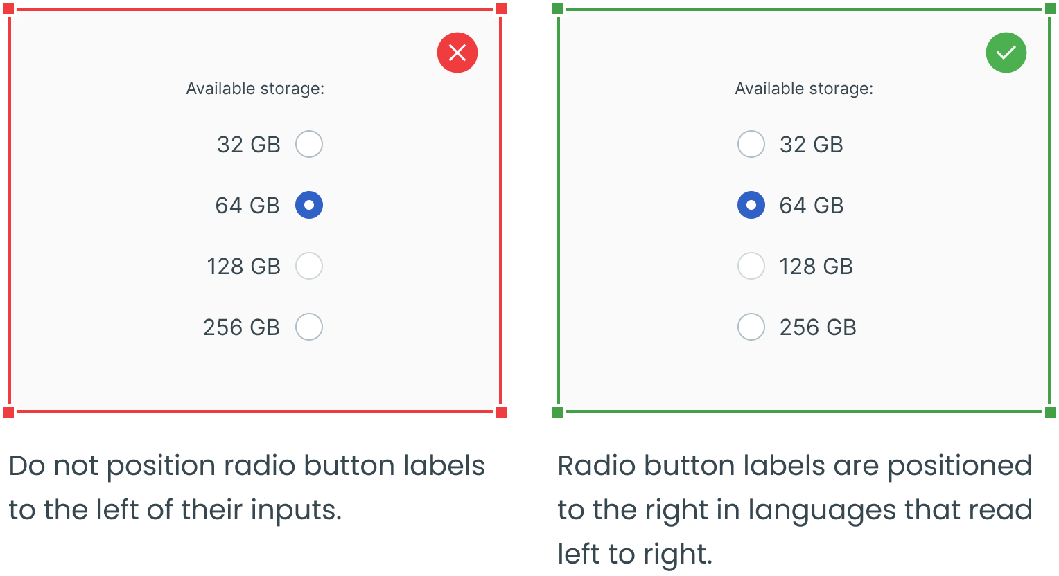
The radio button component is comprised of a set of clickable circles with labels positioned to the right. If there are multiple radio buttons, a group label can be added.
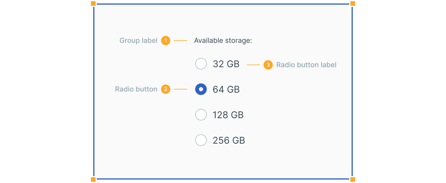
1. Group Label
Describes the options and guides the user when making a selection.
2. Radio Button Input
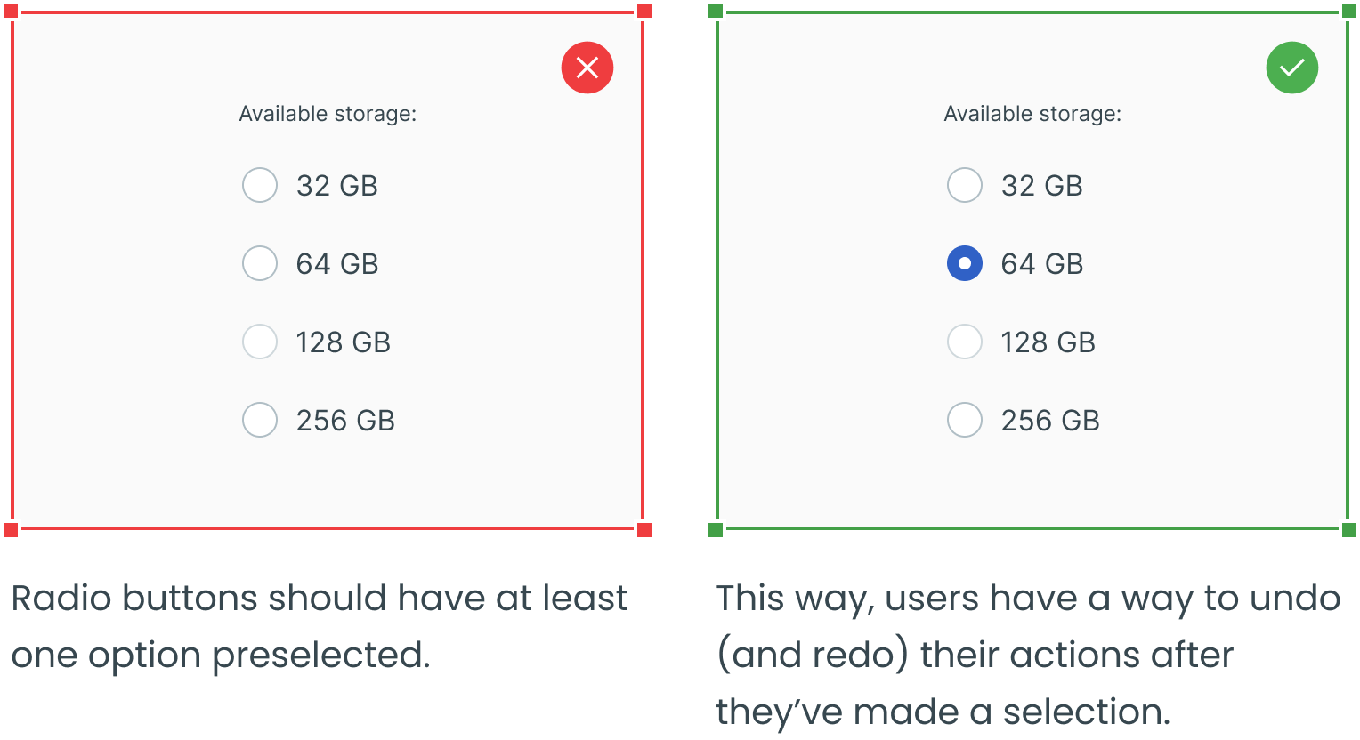
A radio button indicates the appropriate state. One option should be selected by default.
3. Radio Button Label
It describes the information you want to select or unselect.
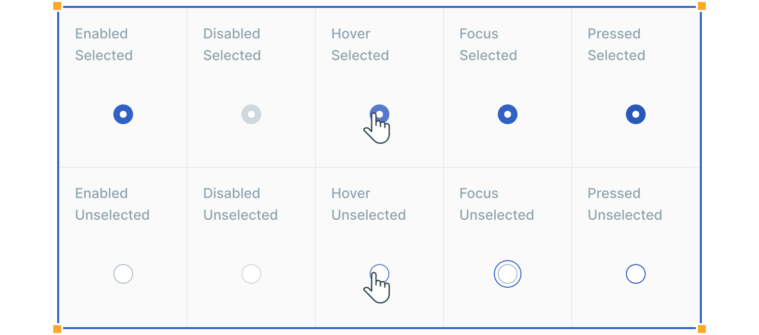
States
Radio buttons have at least two states – unselected and selected. The default view should have at least one radio button preselected. In addition to unselected and selected states, radio buttons also have enabled, disabled, hover, focused and pressed states.
Interactions
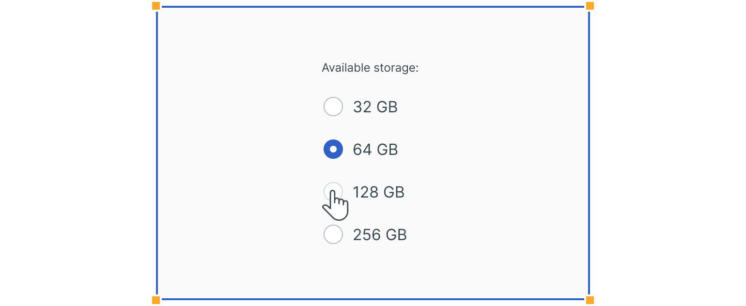
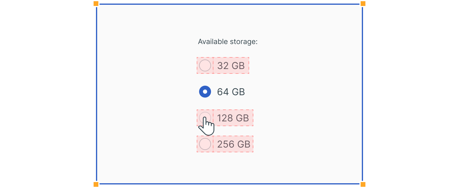
Users can trigger an item by directly clicking the radio button input or clicking the radio button label. Having both regions interactive creates a more accessible click target.
Usage
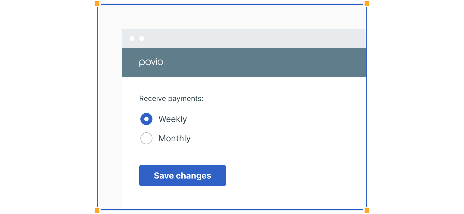
Form
Radio buttons can be used in forms on a page, modals or side panels.
Selection in Lists
They can be used to choose an item within data tables or lists.
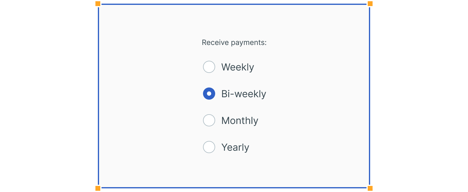
Settings
They can also be used to change from one setting to another in a menu or page.
Guidelines
Here are some examples of using radio buttons and what to avoid.
Right Align Radio Button Labels
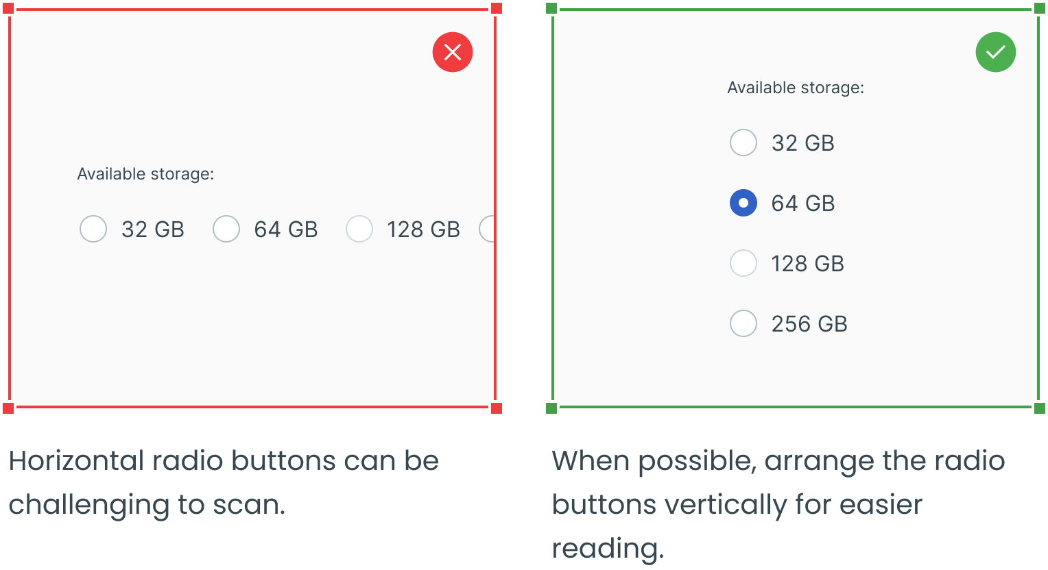
Try Avoiding Horizontally Aligned Radio Buttons
Select One of the Radio Buttons by Default
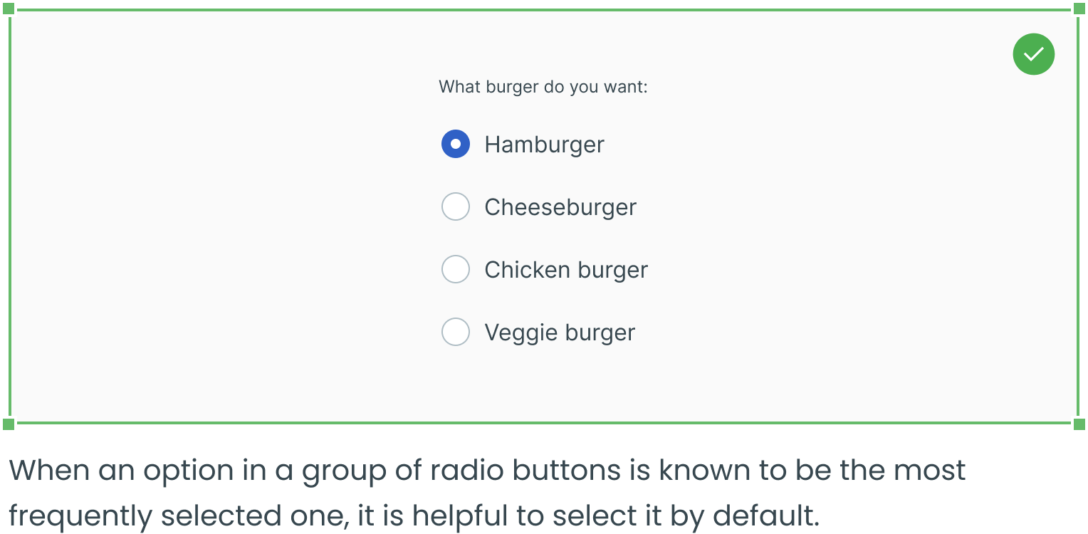
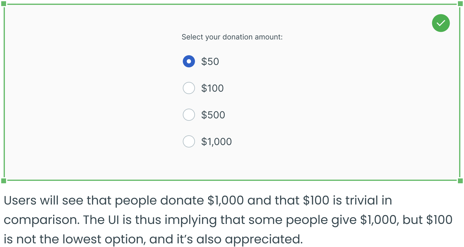
Consider Selecting the Most Frequent Option by Default
Consider Selecting the Suggested Option by Default
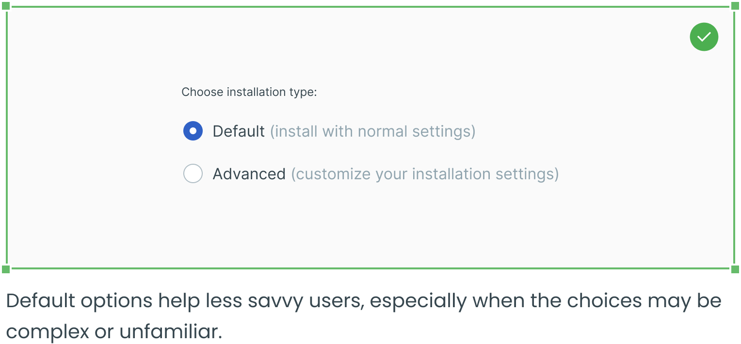
Consider Selecting the Desired Option by Default
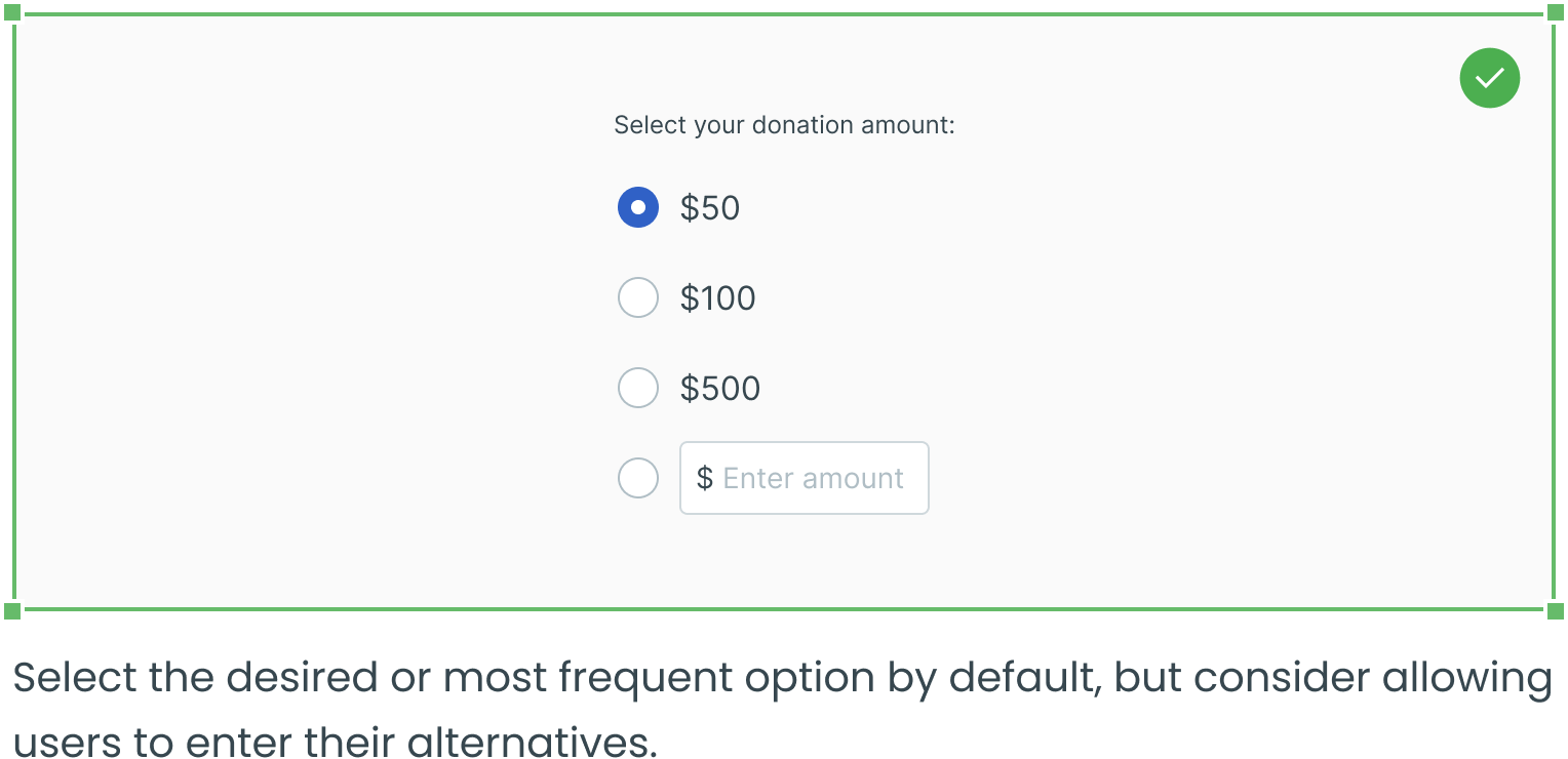
Consider Adding a Text Field for Additional Options
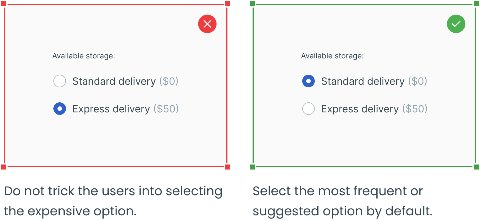
Avoid Presumptuous Default Selections
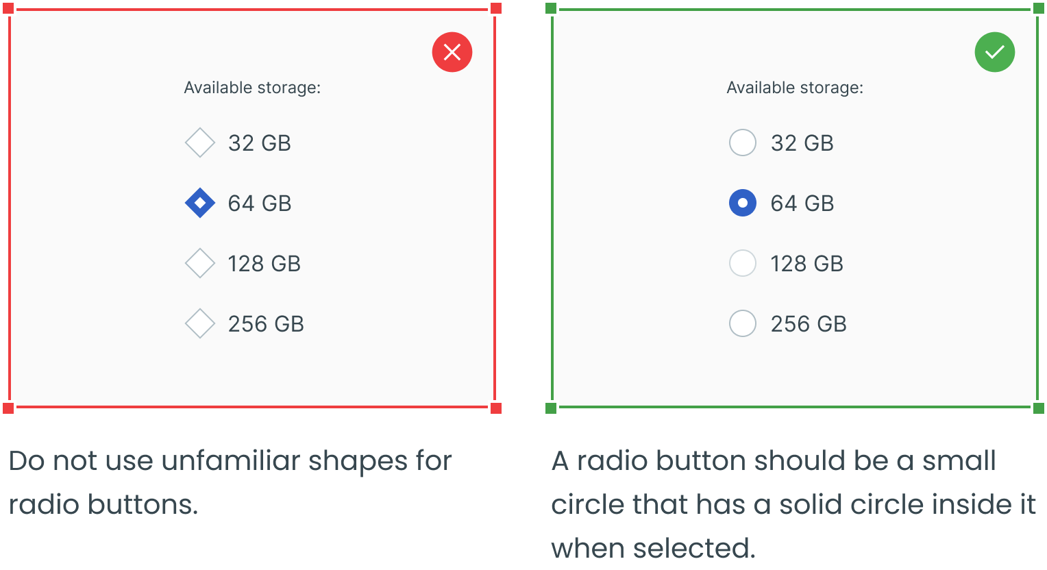
Use a Standard Visual Representation
Use Radio Buttons Where Options are Mutually Exclusive
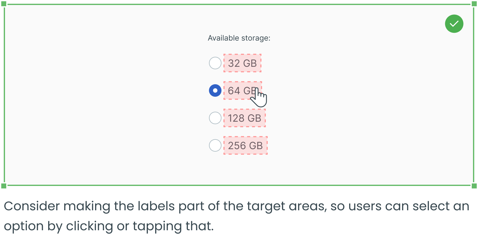
Make the Label Clickable
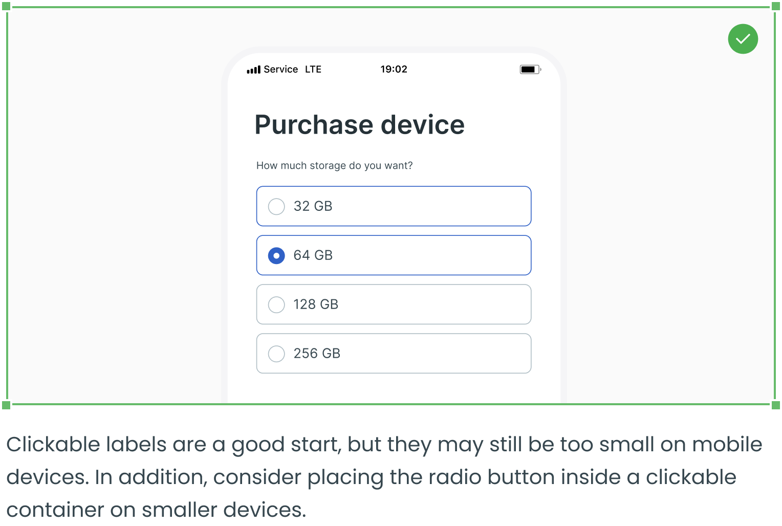
Expand the Target Area on Mobile Devices
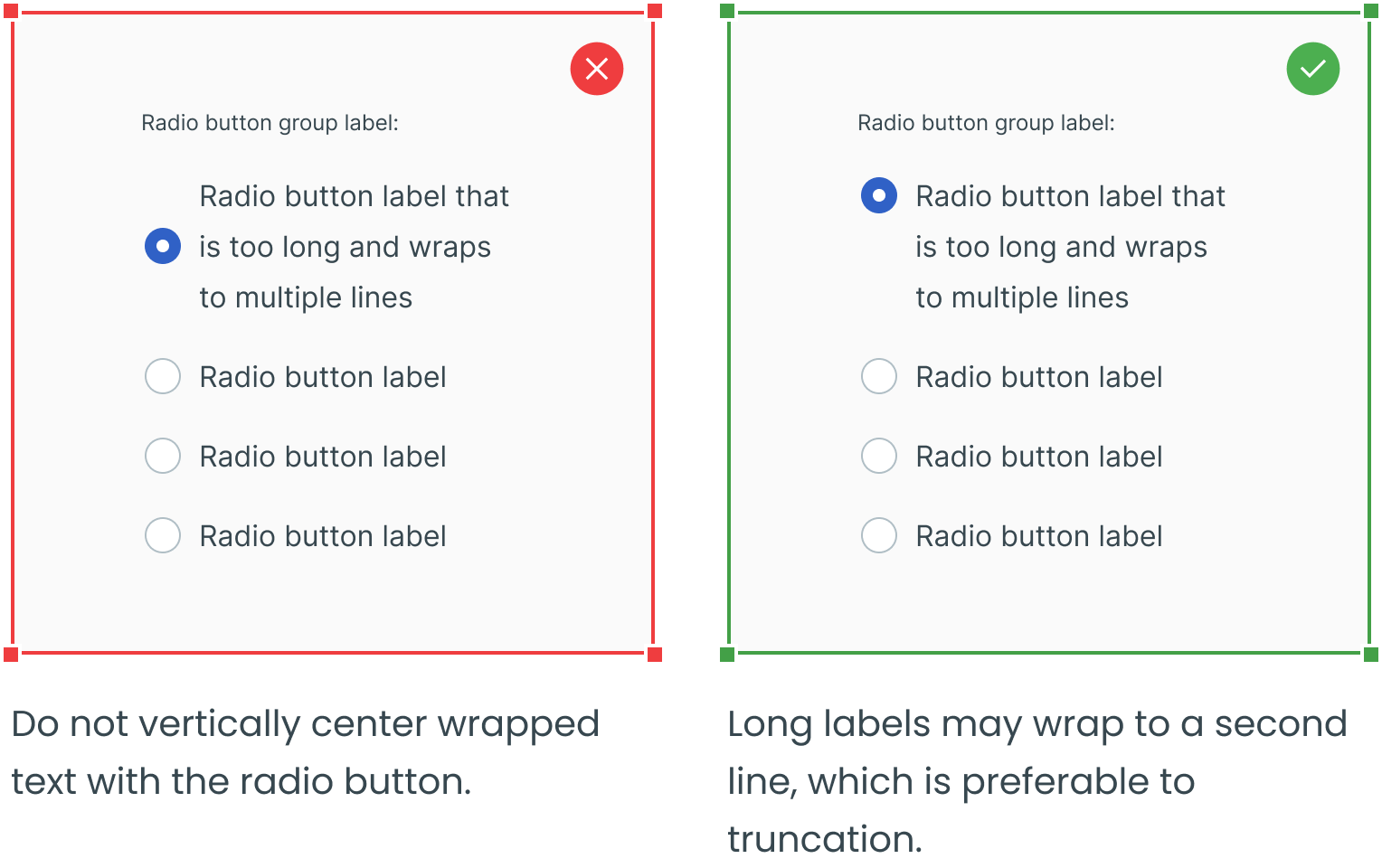
Overflow Content
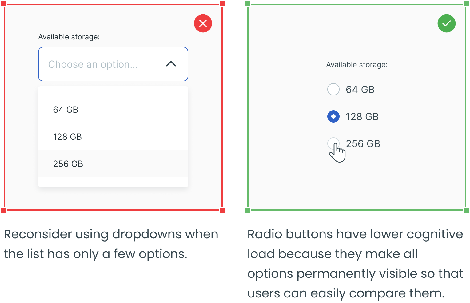
Consider Using Radio Buttons Instead of Dropdowns
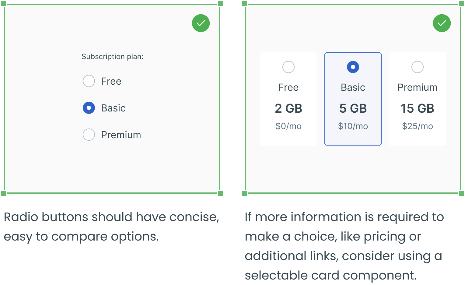
Radio Button VS a Card Component
_________
Text fields, dropdowns, checkboxes and forms are four other essential user interface elements you should be familiar with in addition to radio buttons.
Check out the rest of the series for more information on each design element, as well as guidelines for their use:
